-
More about Happiness... →
In our previous post we analyzed some happiness data. As I mentioned I got statistical figures for world regions on several parameters from Kaggle, for the years 2015, 2016 and 2017. We analyzed 2015 data in the last post. What confuses me now is how did they even come up with 2017 data (the year is not yet over). Or is this calendar also a confused one like tax calendars ;-)
In any case, let’s look at whatever was called 2017 data. I had to clean up the data-set as it had different names for some of the parameters, it had some differences in the countries (for example, South Sudan is the newest country and it appears in 2017 data-set, etc.). I renamed some of those fields, added the
Regionparameter comparing the countries against 2015 data-set, etc. There were still some discrepancies as data about some of the countries just does not exist in the 2017 data-set. The results we plotted in our previous post look more or less similar with the 2017 data as well. But I wanted to dig deeper and plot the happiness rankings of individual countries and here’s how it looked:
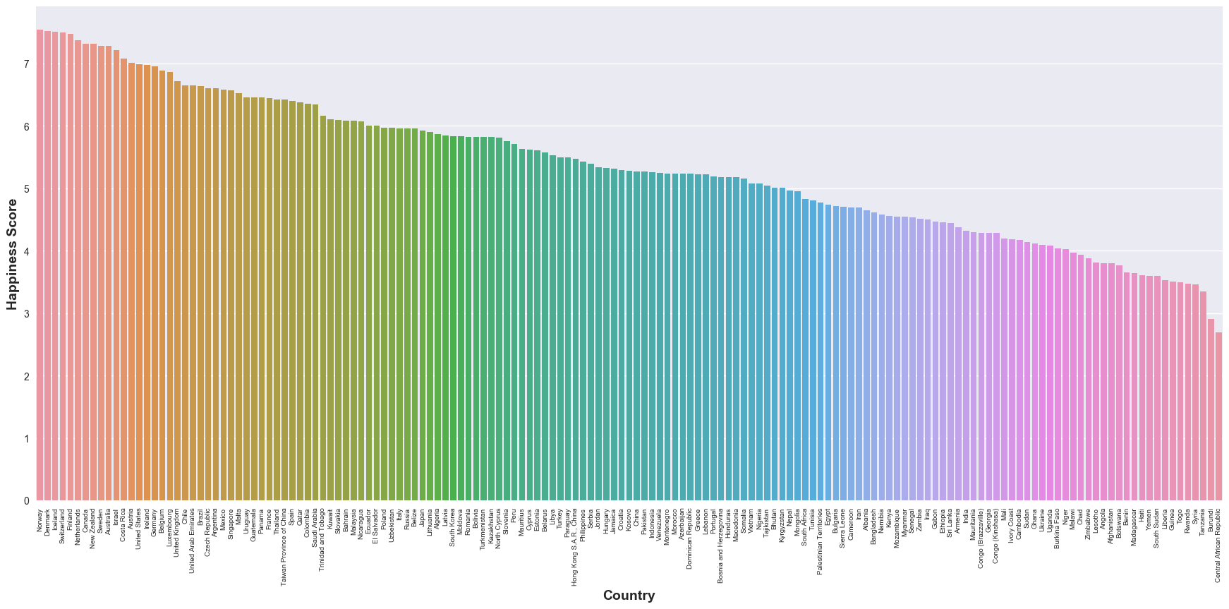
Not that I don’t want some of the countries to be unhappier, but some of the data points are counter-intuitive to my (perceived) knowledge of world regions. This is also a demonstration of my perceptions of different parts of the world and how many things can not just be captured in data. Some day, I would really want to dig into how this
Happiness Scoreis computed and to check if it is meaningful at all. -
Thinking about Happiness... →
Lately, I have been pondering a lot about happiness and satisfaction and so, let’s talk about it in a data-driven fashion. I downloaded some global data (for 2015, 2016, 2017) from Kaggle that has several information on happiness, life expectancy, trust factor (essentially, a score of the perceived trust on the government), etc. Let’s start with 2015 data, as that’s what I analyzed first. Again, we will use Pandas library for data analysis and seaborn library to plot the data and make our inference from the plots.
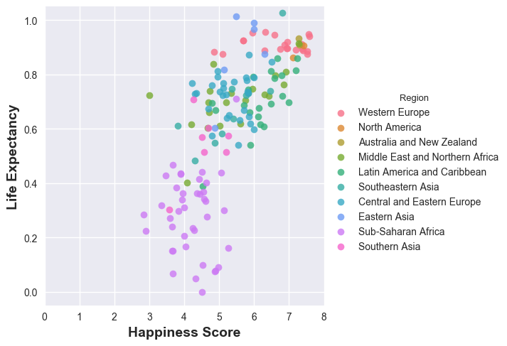
Let’s first plot the “Happiness Score” of the world regions and see which regions of the world are the happiest. And then, we shall plot the life expectancy of the regions of the world and see the correlation.
df_2015 = pd.read_csv('2015.csv')
sns.swarmplot(y='Region', x='Happiness Score', data=df_2015)
plt.ylabel('Region of the World', fontsize=14, fontweight='bold')
plt.xlabel('Happiness Score',fontsize=14, fontweight='bold')
And here is what we see:
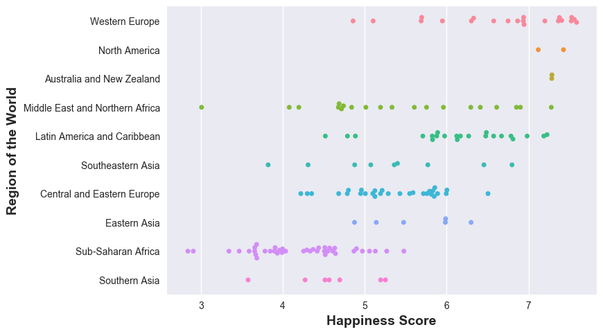
Western Europe, North America, Australia and New Zealand lead the pack in happiness - why not? wealthy, rich economies, while Sub-Saharan Africa is not doing good - that’s sad. Now, let’s see how happiness is correlated to life expectancies in the the different parts of the world. A word of caution though: life expectancy actually depends on a variety of factors - epidemic, region conflicts, wars, poverty, etc. all contribute to life expectancy - but these factors also affect the happiness (to what precise extent? has someone measured? - I do not know).
sns.lmplot(y='Health (Life Expectancy)', x='Happiness Score',
           fit_reg=False, data=df_2015, hue='Region')
plt.ylabel('Life Expectancy', fontsize=14, fontweight='bold')
plt.xlabel('Happiness Score',fontsize=14, fontweight='bold')
And here’s the result:
More on individual countries in a later post.
-
Analyzing some more Pokemon data →
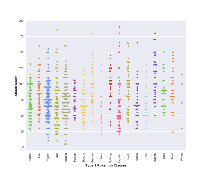
Let’s continue with our data from previous post and try to look at one more fancy function from the seaborn library. In particular, we will use seaborn’s
swarmplotfunction to see how the Attack scores of Type-1 Pokemons of each Type-1 class are spread out.pokemon_colorsis just an array of colours for different pokemon classes.sns.swarmplot(x='Type 1', y='Attack', data=df, palette=pokemon_colors)And here’s the result:
-
Playing with some more Pokemon data →
Let’s play with some more Pokemon data. Just to recollect, we played with the same data-set way back in this post. Today, along with the other libraries, we will also use seaborn to make fancy plots very quickly.
Let’s do the initial imports as before, this time also importing
seabornimport pandas as pd import matplotlib.pyplot as plt import seaborn as snsLet’s grab the data-set and try to see the
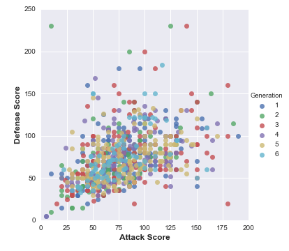
AttackandDefensescores of the different generations of Pokemons.# read the dataset df = pd.read_csv('Pokemon.csv', index_col=0)sns.lmplot(x='Attack', y='Defense', data=df, fit_reg=False, hue='Generation') # specify the axes limits plt.ylim(0,250) plt.xlim(0,200)Here, we use seaborn’s function for plotting the data. As it is a function for regression, it would also draw a line showing the boundary. We set
fit_regtoFalsein order to avoid it drawing the regression fit (line of best fit). This is the outcome of the above exercise:
-
Binary Search Tree →
In a previous post, we saw binary trees. Today, we will see Binary Search Trees (BST). The key difference is that when we insert nodes into our tree, we make sure the items whose values are less than that of the root are added to the left sub-tree and the ones whose values are greater than that of the root are added to the right sub-tree. Let’s start by defining our data structure. The definition is the same as our earlier tree definition. Just for the sake of clarity let’s call our type
bst.type 'a bst = | Leaf | Node of 'a tree * 'a * 'a tree;;Now, for inserting an element into our tree, we wouldn’t just insert the element as we did earlier, but we shall compare the element to the root and decide which of the sub-trees (left or right) we want to insert our new item to. This looks like a very small difference - but it has huge implications for search.
let rec insert x bst =
  match bst with
  | Leaf -> Node (Leaf, x, Leaf)
  | Node (left, n, right) ->
     if (x < n) then Node (insert x left, n, right)
     else Node (left, n, insert x right);;
Let’s also write the function to create a bst from an input list, which again is the same as before:
let rec make_bst lst =
  let empty = Leaf in
  match lst with
  | [] -> empty
  | h::t -> insert h (make_bst t);;
In future posts, we will see the different ways we can traverse this tree.