Thinking about Happiness... →
Lately, I have been pondering a lot about happiness and satisfaction and so, let’s talk about it in a data-driven fashion. I downloaded some global data (for 2015, 2016, 2017) from Kaggle that has several information on happiness, life expectancy, trust factor (essentially, a score of the perceived trust on the government), etc. Let’s start with 2015 data, as that’s what I analyzed first. Again, we will use Pandas library for data analysis and seaborn library to plot the data and make our inference from the plots.
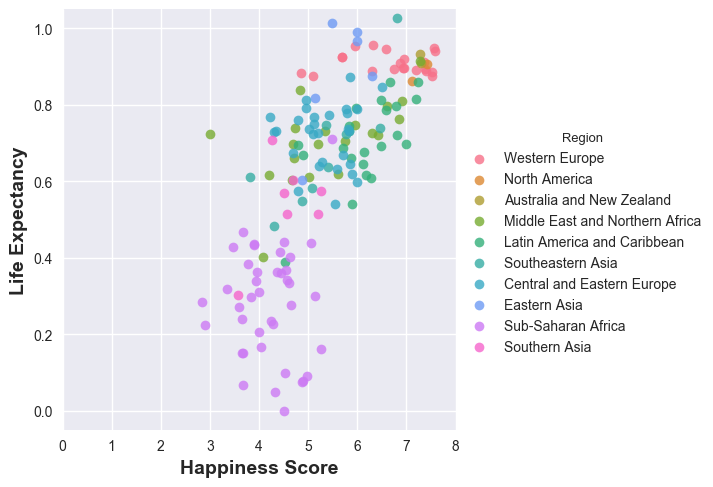
Let’s first plot the “Happiness Score” of the world regions and see which regions of the world are the happiest. And then, we shall plot the life expectancy of the regions of the world and see the correlation.
df_2015 = pd.read_csv('2015.csv')
sns.swarmplot(y='Region', x='Happiness Score', data=df_2015)
plt.ylabel('Region of the World', fontsize=14, fontweight='bold')
plt.xlabel('Happiness Score',fontsize=14, fontweight='bold')
And here is what we see:
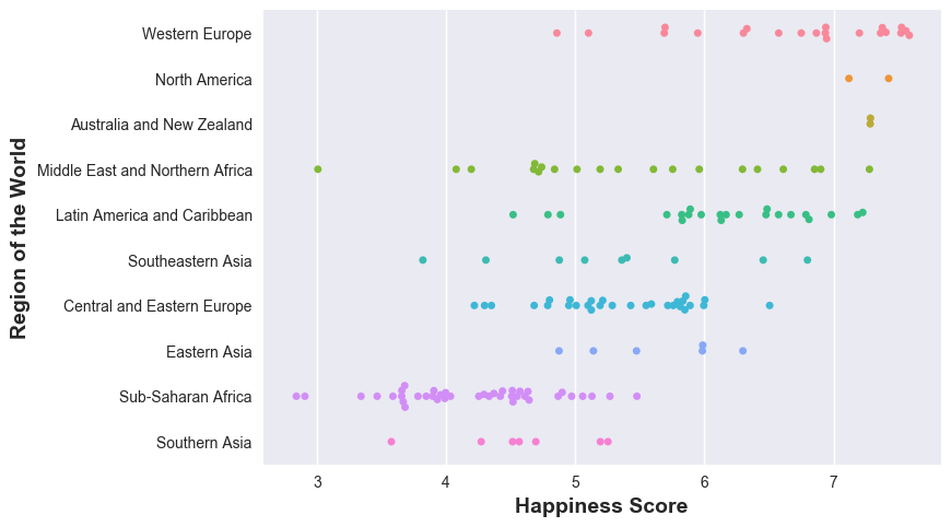
Western Europe, North America, Australia and New Zealand lead the pack in happiness - why not? wealthy, rich economies, while Sub-Saharan Africa is not doing good - that’s sad. Now, let’s see how happiness is correlated to life expectancies in the the different parts of the world. A word of caution though: life expectancy actually depends on a variety of factors - epidemic, region conflicts, wars, poverty, etc. all contribute to life expectancy - but these factors also affect the happiness (to what precise extent? has someone measured? - I do not know).
sns.lmplot(y='Health (Life Expectancy)', x='Happiness Score',
           fit_reg=False, data=df_2015, hue='Region')
plt.ylabel('Life Expectancy', fontsize=14, fontweight='bold')
plt.xlabel('Happiness Score',fontsize=14, fontweight='bold')
And here’s the result:
More on individual countries in a later post.