Playing with some more Pokemon data →
Let’s play with some more Pokemon data. Just to recollect, we played with the same data-set way back in this post. Today, along with the other libraries, we will also use seaborn to make fancy plots very quickly.
Let’s do the initial imports as before, this time also importing seaborn
import pandas as pd
import matplotlib.pyplot as plt
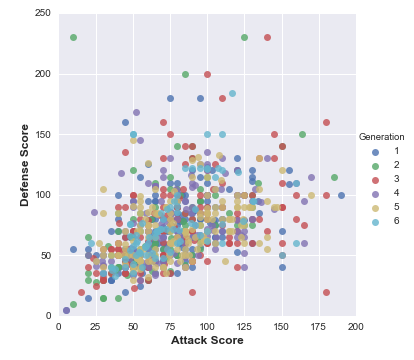
import seaborn as snsLet’s grab the data-set and try to see the Attack and Defense scores of the different generations of Pokemons.
# read the dataset
df = pd.read_csv('Pokemon.csv', index_col=0)sns.lmplot(x='Attack', y='Defense', data=df,
fit_reg=False,
hue='Generation')
# specify the axes limits
plt.ylim(0,250)
plt.xlim(0,200)Here, we use seaborn’s function for plotting the data. As it is a function for regression, it would also draw a line showing the boundary. We set fit_reg to False in order to avoid it drawing the regression fit (line of best fit). This is the outcome of the above exercise: