More about Happiness... →
In our previous post we analyzed some happiness data. As I mentioned I got statistical figures for world regions on several parameters from Kaggle, for the years 2015, 2016 and 2017. We analyzed 2015 data in the last post. What confuses me now is how did they even come up with 2017 data (the year is not yet over). Or is this calendar also a confused one like tax calendars ;-)
In any case, let’s look at whatever was called 2017 data. I had to clean up the data-set as it had different names for some of the parameters, it had some differences in the countries (for example, South Sudan is the newest country and it appears in 2017 data-set, etc.). I renamed some of those fields, added the Region parameter comparing the countries against 2015 data-set, etc. There were still some discrepancies as data about some of the countries just does not exist in the 2017 data-set. The results we plotted in our previous post look more or less similar with the 2017 data as well. But I wanted to dig deeper and plot the happiness rankings of individual countries and here’s how it looked:
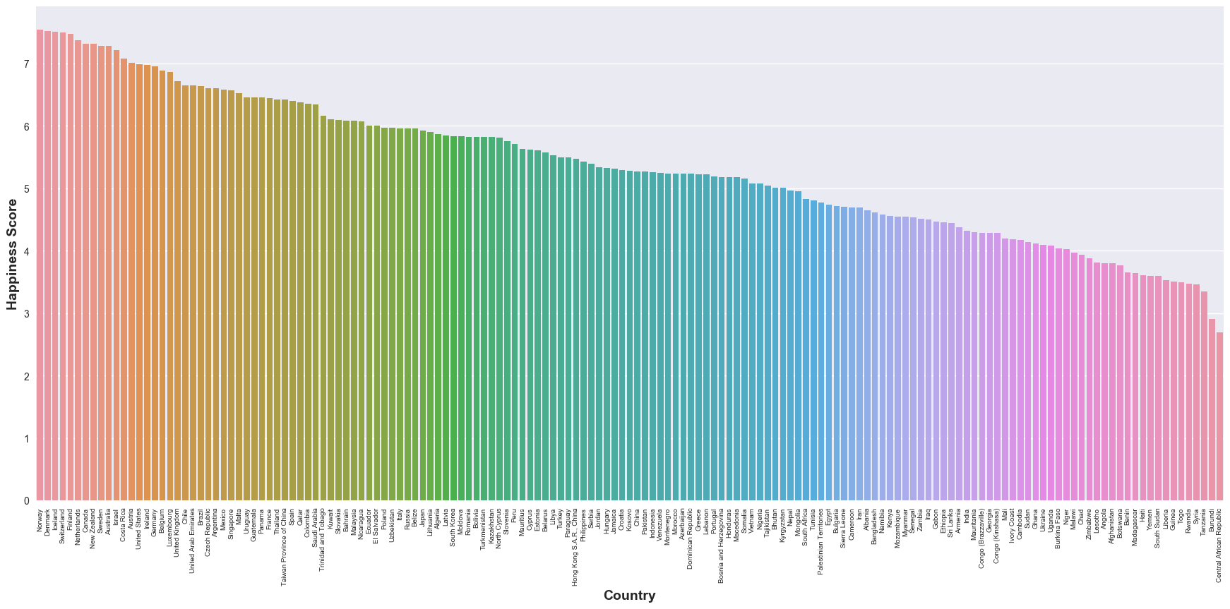
Not that I don’t want some of the countries to be unhappier, but some of the data points are counter-intuitive to my (perceived) knowledge of world regions. This is also a demonstration of my perceptions of different parts of the world and how many things can not just be captured in data. Some day, I would really want to dig into how this Happiness Score is computed and to check if it is meaningful at all.