-
What have people been watching on YouTube? →
For more than 15 months people around the world are mostly staying indoors, those who could are working from home, vacations and other outdoor entertainments have come to a standstill. At the same time, NetFlix, gaming, and other entertainment like TV and YouTube must have become more popular - after all, these are the forms of indoor entertainment. I decided to look at what people have been interested within this limited set of entertainment avenues. While I could not find most data, YouTube data was available and regularly updated. I decided to download the dataset that contains YouTube data from August 2020 until early June 2021. Let us see what people (in the U.S.) have been watching on YouTube during this period.
yt_us = pd.read_csv('US_youtube_trending_data.csv')
yt_categories = pd.read_json('US_category_id.json')
yt_us.dtypes
The different features in the dataset are (after casting
publishedAtandtrending_datetodatetimetype):video_id object title object publishedAt datetime64[ns, UTC] channelId object channelTitle object categoryId object trending_date datetime64[ns, UTC] tags object view_count int64 likes int64 dislikes int64 comment_count int64 thumbnail_link object comments_disabled bool ratings_disabled bool description objectThere are different categories of videos in the dataset, and these are the number of videos in each category.
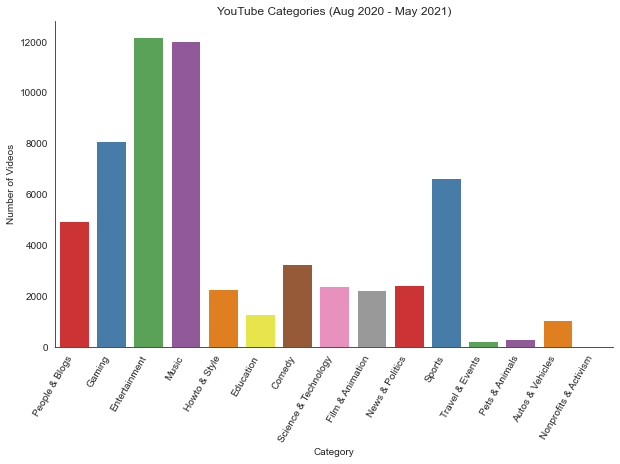
I am surpised by the number of videos in some of the categories or the categorization itself. There is a category on
People & Blogs- I am not sure what it refers to. I do know artists have their own channels and YouTube is a more lively form of a blog, but there is also Music (some of the channels there might also be by music artists). While I try and understand how the different videos are categorized, let us look at some other stats.Let us find out how many aggregate views each of the different categories has:
cat_view_count_df = yt_us.groupby(['categoryId'])['view_count'].agg(['sum'])

chart = sns.barplot(
        data=cat_view_count_df,
        x='categoryId',
        y='view_count',
        palette='Set2',
        order=cat_view_count_df.sort_values('view_count', ascending=False).category
)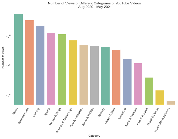
Not surprisingly, Music, Entertainment and Gaming are right at the top. Unfortunately, Education category is way behind. I find YouTube as a wonderful source of education. But may be this is due to Coursera, Udacity, etc. having their own video encoders and decoders and do not have their content on YouTube.
Let us see which were the Top 50 most viewed videos during the time period, in the U.S.
# create a new column 'count_max_view' to collect max view_count
yt_us['count_max_view'] = yt_us.groupby(['video_id'])['view_count'].transform(max)
# sort the column so that we can pick out the top 50
top50 = yt_us[yt_us['view_count'] == yt_us['count_max_view']].sort_values(by=['count_max_view'],
                                                                          ascending=False).head(50)
# remove non alpha-numeric characters from the titles
top50.title = top50.title.str.replace('[^a-zA-Z0-9]', '')
And let us plot the dataset to see which ones are on the top:
fig = sns.catplot(
            data=top50,
            x='title',
            y='view_count',
            kind='bar',
            palette='muted',
            aspect=2,
            legend=False
)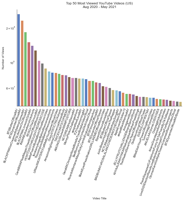
Since I am fond of Education, I would like to see which YouTube channels have maxinum number of views and check if any of my favourite channels appear in the list.
yt_edu = yt_us[yt_us['categoryId'] == 'Education']
yt_edu = yt_edu.groupby(['channelTitle'])['view_count'].agg(['sum'])
chart = sns.barplot(
        data=yt_edu,
        x='channelTitle',
        y='view_count',
        palette='Set2',
        order=yt_edu.sort_values('view_count', ascending=False).channelTitle
)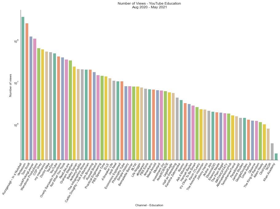
I see a lot of interesting channels - Khan Academy seems to have just made it to the list. I also see a channel
YouTube. I see lots of interesting channel names and I hope to spend more time exploring those on YouTube very soon.The YouTube dataset is also available for other geographies. Someday, I would like to compare how the interests in different geographies differ by comparing YouTube channels’ popularity. It may not be an accurate representation of interests at all, but it should be a fun exercise.
-
U.S. - Job Losses and Recovery →
In a previous post, we saw how many jobs the different states in the U.S. have lost over the years primarily due to trade deficits. In this post, we will visually analyze the data from BLS and compare the effects of 2008 recession and the ongoing pandemic on the state of employment in the U.S. across different sectors.
The covid-19 pandemic has definitely wrecked the employment across several sectors of the labor economy and not just the hospitality sector. If we look at the employment numbers for an year starting from January 2020, job losses are evident. We also see the quick recovery (though not to January-2020 levels) in several of the sectors.
job_cols = ['Manufacturing Jobs', 'Hospitality Jobs', 'Wholesale Jobs',
       'Retail Jobs', 'Transportation Jobs', 'Construction Jobs',
       'Education Health Services Jobs', 'Finance Jobs', 'Information Jobs',
       'Mining Jobs', 'Other Services Jobs', 'Professional Services Jobs',
       'Utilities Jobs']
fig = px.area(pandemic_df, x="Month", y=job_cols,
              template='simple_white')
fig.add_annotation(...)
...
fig.show()
If we zoom out in the data set and look at two decades of employment numbers all the way from January 2001 until January 2021, we also see the effect of 2008 recession on employment numbers. We also see how gradual and prolonged the effect of 2008 recession was. The job losses across sectors during the pandemic was sudden and steep and the recovery of numbers was also quick.
fig = px.area(emp_df, x="Month", y=job_cols,
                   template='simple_white')
fig.add_annotation(...)
...
fig.show()
We can just hope that the recovery from the pandemic continues quicker and reaches early 2020 levels, not only in the U.S. but across the globe. Given that the world is very globalized today than ever before, anyone is healthy and good only when everyone is healthy and good.
The tabular BLS data was parsed using BeautifulSoup, and the plots were done using plotly and chart_studio.
-
Jobs, Offshoring and Unemployment - US →
With 2020 being one of the worst in recent history, for many reasons fuelled by the pandemic. With many countries being unprepared to handle a pandemic of this size, it also exposed the global supply chain being highly optimized rather than flexible. It also exposed the inequality in society - healthcare, job security, income, etc. Many countries had to start manufacturing personal protective equipments (PPE), ventilators, etc. by themselves to serve the local needs rather than rely on the supply chain that got stalled. A couple of decades ago, many of these equipments were manufactured locally but over time, many of those got offshored.
However, this post is not about unemployment due to the pandemic. It is more about loss of U.S. jobs over the period 2001-2017, mostly due to trade deficits, with data from this report and manufacturing data from BLS data.
The first decade of the century was the worst for U.S. manufacturing jobs. It saw the steepest decline in such jobs, in a very long time. There are two conflicting theories around this - one argues the loss is due to increased automation, while the other attributes the loss to offshoring of such jobs. I could not find the data on rate of automation or increase in manufacturing jobs in other geographies during the time period in order to analyze it analytically. However the loss of jobs, whatever being the root cause, is itself staggering.
import plotly.express as px
fig = px.bar(emp_df[:100], x='Month', y='Manufacturing Jobs', height=600, color='Manufacturing Jobs',
            labels=dict({'Manufacturing Jobs':'Manufacturing Jobs (in thousands)'}),
            template='simple_white')
fig.update_layout(
    autosize=False,
    width=700,
    height=700
)
fig.show()
Apparently, about four decades ago the Bay Area in California was full of orange orchards, and a couple of decades later they all became startups working in electronics and software (Silicon Valley). They were not startups making apps that let teenagers poke and swipe at each other but advanced electronics and software that goes along with it, like routers, modems, semiconductor chips, etc. There were supposedly many small enterprises manufacturing circuit boards and assembling systems for these famous companies.
An old video of Macintosh Factory in Fremont:
But does it mean only the electronics jobs got offshored? Not really. If we look at the data deeper and look at the number of jobs lost state-wise, it gives a more detailed picture. Almost every major state in the U.S. has lost thousands of jobs from 2001-2017, with most of the loss happening between 2001-2009. Many other states would have seen loss of jobs in other industries like automobiles and steel included.
fig = px.bar(df, x='State', y='Jobs Lost', height=600, color='% Jobs Lost',
             labels=dict({'Jobs Lost':'Jobs Lost (in thousands)'}))
fig.show()
If we look even deeper into the data, we can see how many jobs were lost in each state’s congressional districts.
fig = px.bar(df, x='Total Jobs', y='State', color='% Jobs Lost',
             labels=dict({'State':'States and Congressional Districts'}),
             hover_name='Congressional District')
fig.show()
When I find reliable data on rate of automation and manufacturing jobs gained in other geographies, analysis of that data would help in putting the pieces together. While I am not against offshoring, I am all for a more flexible supply chain, rather than a super-optimized supply chain that would get disrupted affecting the lives and livelihoods of several people, as we witnessed last year when medical devices and PPE supply chain got disrupted.
While many jobs have been offshored causing large scale unemployment, there is still hope for reskilling of workers and creating new jobs that would drive the economy the next two decades - like solar panels, electric batteries, recycling of batteries, advanced technologies for water, air purification, education and healthcare, etc.
The tabular data from EPI report was parsed using BeautifulSoup, and the plots were done using plotly and chart_studio.
-
Is it GameStop vs Hedge Funds or GameStop vs Streaming? →
Everyone knows GameStop now, and its ticker symbol too - gamers, non-gamers, traders, non-traders, all alike.
GameStop is a chain of retail stores that sells game merchandise, equipment and at one point (when games were sold on CDs) games. Retail is moving online and if the product is software, it has already moved. I can’t recollect the last time I saw Windows OS or Office sold in a CD.
Hedge funds apparently make money by betting on such companies - borrow money or company shares from some lender promising to repay and in the mean time, bet on the downside of the company, wait for the price to crash, buy the stock (for cheap) and give it back to the lender (pocketing the difference). I am not sure how they pick companies to bet on. However, late last year and early January, GameStop was the candidate. In order to revolt againt this, some online enthusiasts mobilized themselves to buy options on this stock, thereby increasing the stock price (‘stock price’ not ‘company value’) that would hurt the Hedge funds’ intentions.
Let us look at some data to see if Hedge funds are the real detterants to GameStop’s future or if there are other factors - like streaming. It was not just GameStop (GME), but also Nokia (NOK), AMC and Blackberry (BB) that went through this early January, but GameStop had the biggest change. Just to show the trend in these stocks (GameStop removed from the plot below as the change in GME was too high that the other trends wouldn’t show up well). Notice how the overall trend in stock prices have been over the last few years and how it changed towards the end of 2020 and early 2021.
...
plt.plot(amc_df['Date'], amc_df['Adj Close'], label='AMC')
plt.plot(nok_df['Date'], nok_df['Adj Close'], label='NOK')
plt.plot(bb_df['Date'], bb_df['Adj Close'], label='BB')
plt.plot()
...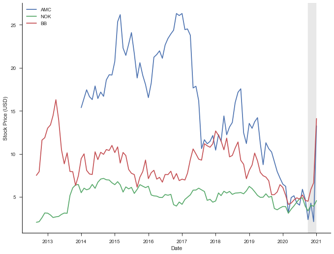
In order to see what (game) streaming industry is like, I started looking for data on this - number of subscribers, streamers, etc. I found Twitchtracker that tracks statistics on Twitch. Since Twitch’s data was easiest to get and well organized, I decided to look at just Twitch data (number of concurrent viewers) and plot it alongside GameStop stock price over the years.
fig, ax1 = plt.subplots()
ax2 = ax1.twinx()
line1, = ax1.plot(gme_df['month'], gme_df['Adj Close'], color='blue')
line2, = ax2.plot(twitch_df['month'], twitch_df['avg_concurrent_viewers']//1000, color='green')
...
plt.show()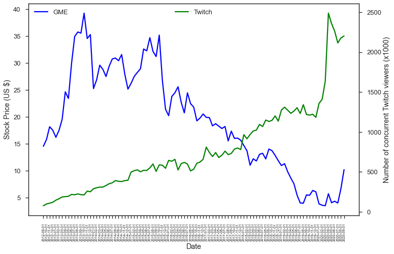
The number of Twitch channels also keep increasing along with the number of viewers and this trend is only likely to continue during these pandemic times.
fig = px.scatter(df, x='avg_concurrent_viewers',
                     y='avg_concurrent_channels',
                     size='time_watched')
fig.show()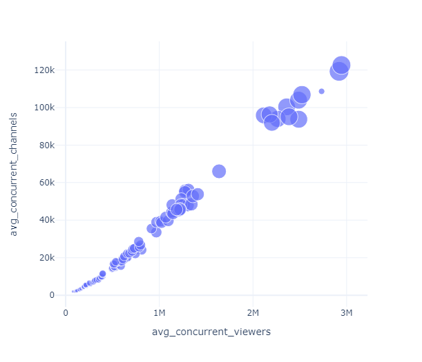
On the other hand many retail stores like GameStop’s were hit hard during the pandemic.
Everyone can infer the trend in the industry. Hedge funds are disliked for several reasons, some of them valid. But the future of gaming is online and if GameStop were to survive, it has to build that future than anchor itself in its glorious past.
The data from Twitchtracker was parsed using BeautifulSoup, and the plots were done using matplotlib, seaborn and plotly.
-
TSLA joins S&P 500 →
A week ago Tesla Motors (TSLA) joined the S&P 500 Index - the stock market index that keeps track of the performance of 500 largest companies listed in stock markets in the US. Overall TSLA has been very volatile - many argue that the volatility (risk) indicates the opportunies for Tesla. Now that we are towards the end of the year, a pandemic year, let’s see how the S&P 500 performed and how Tesla performed.
And in terms of the value of TSLA stock and S&P 500 Index, this is how they fared during this year:
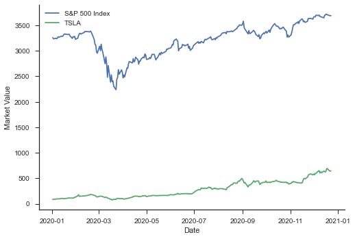
tsla_df = pdr.get_data_yahoo("TSLA",
                              start="2010-07-01",
                              end="2020-12-20",
                              interval="wk")
...
...
plt.plot(snp_df['Date'], snp_df['Adj Close'],label='S&P')
plt.plot(tsla_df['Date'], tsla_df['Adj Close'], label='TSLA')
plt.xlabel('Date')
plt.ylabel('Market Value')
...
...
All the data was collected using pandas_datareader and the plots done using seaborn library.