The Year in Formula One →
If you are someone who has been watching Formula One over the last decade, it would be safe to bet that you agree 2021 has been one of the exciting year in the sport. Lots of uncertainity, lots of controversies, new, young and energetic racers, and a super-busy calendar with 22 races. In this post, we will look at the last decade in the sport while doing so using Python and Pandas to analyze, plot and visualize the data.
import pandas as pd
constr_df = pd.read_csv('driver_standings_2010_2021.csv')
driver_df = pd.read_csv('f1_2010_2021.csv')
If we look at the total points by different teams:
team_totals = pd.DataFrame(constr_df.groupby(['team'])['points']
                           .sum()
                           .sort_values(ascending=False))
                           .reset_index()

sns.barplot(x='team', y='points',
                 data=team_totals)
...
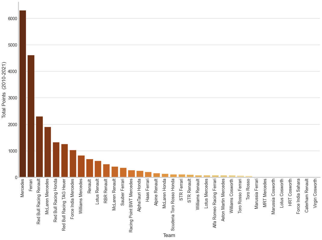
Mercedes is clearly the front runner, most of it contributed by Lewis Hamilton as we will see very soon. Having lived in Italy and a Ferrari Fan, it is sad to see Ferrari in second place and even more sad to see the downward trend for the prancing horse.
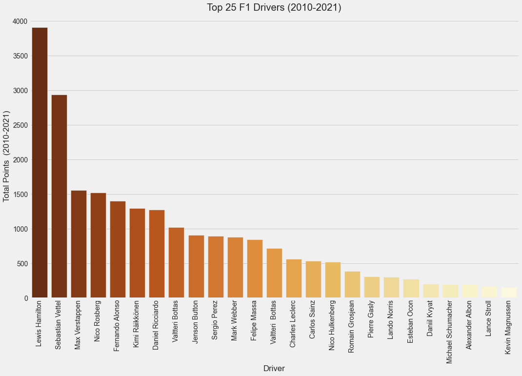
Let’s turn to the drivers who play a key role in making the sport what it is. After Mike Schumacher’s retirement, there was some competition between Sebastian Vettel and Lewis Hamilton and to some extent Fernando Alonso and Nico Rosberg. Unfortunately Sebastian Vettel’s dominance faded away and Lewis Hamilton started dominating every race. Very soon there was a new kid in the block - Max Verstappen. Young, energetic and impatient, Max Verstappen, racing for RedBull, quickly started dominating the sport throwing a big challenge to Lewis Hamilton. Many predicted his dominance given the last couple of years and if there was even the slightest of doubts, the 2021 racing season would have cleared those away. Just before the last race, Lewis Hamilton and Max Verstappen were tied on the same number of points which shows the sheer scale of the competition.
driver_totals = pd.DataFrame(driver_df.groupby(['full_name'])['points']
                             .sum()
                             .sort_values(ascending=False))
                             .reset_index()

sns.barplot(x='full_name', y='points',
            data=driver_totals)
...
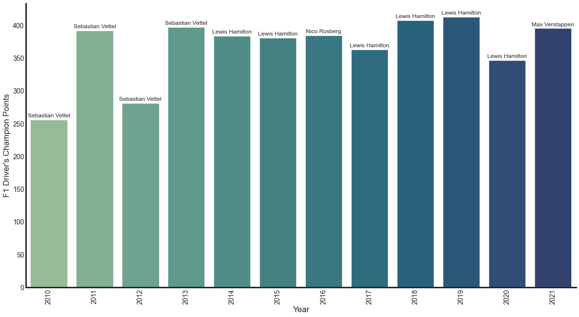
We can also see the maximum points scored by the drivers in any year. This shows Lewis Hamilton dominating the races that were once dominated by Sebastian Vettel.
max_pt_drivers = pd.DataFrame(driver_df[driver_df.groupby(['year'])['points']
                              .transform('max') == driver_df['points']])
ax = sns.barplot(x='year', y='points',
                 data=max_pt_drivers,
                 palette='crest')
for p, (i, txt) in zip(ax.patches, enumerate(max_pt_drivers['name'])):
    ax.annotate(txt,
                xy=(p.get_x() + p.get_width() / 2, p.get_height()),
                xytext=(0, 8), textcoords='offset points',
                ha='center', va='center', size=12
               )
ax.set_xticklabels(ax.get_xticklabels(), rotation=90, fontsize=14);
...
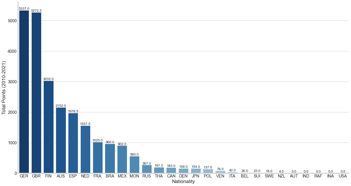
We can also see which countries have scored the most points. Traditionally, Formula One has been more popular in Europe than the rest of the world. There are and were South American champions but not many of them. I believe this might be due to the cost involved in the sport and few can afford it. Further most of the best automobile makers are from Europe (and few from Japan as well). We can attempt to draw a tree map using squarify in Python.
import squarify
country_wins = pd.DataFrame(driver_df.groupby(['nationality'])['points']
                            .sum()
                            .sort_values(ascending=False))
                            .reset_index()

squarify.plot(sizes=country_wins['points'][:21],
              label=country_wins['nationality'][:21],
              alpha=0.8)
plt.axis('off')
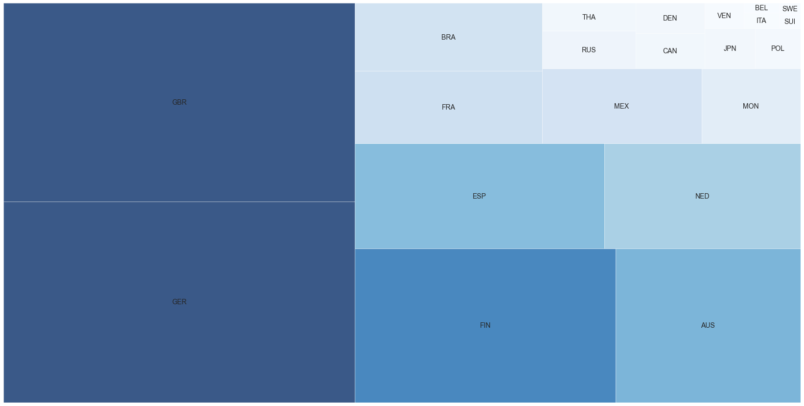
If the tree map makes you think GER (Germany) and GBR (Great Britain) are equal, here is a bar chart showing the actual points.
In all, 2021 was a fantastic year for Formula One. I wish the most crucial and deciding race had not ended in a controversial way. Sergio Perez played the best team-mate and tons of thanks to Lewis and Max for the entertainment.
Looking forward to more competition in 2022.
The data is from a Kaggle dataset revised with the last race results of 2021, and the plots were done using matplotlib, seaborn.