Stories in Charts →
In this post, we will see the most ubiquitous, most useful and also the most easily mis-interpreted data visualization tools - charts. They come in various forms and they are used to represent different aspects of the underlying data. The key assumption is that the visual representation is easier to interpret quickly than in a tabular format. More often, one kind of story a chart conveys might hide another kind of story a different chart, of the underlying dataset, might have conveyed. It is not uncommon to find that the reader would interpret the chart in a way different from what the writer wanted to convey, in which case it is best for the writer to clarify the message being driven.
For example, let us look at the latest global vaccination data. When you look at the per-capita vaccination rates of different countries, and say you pick the top 50 countries, you would see a chart similar to the following (the chart below is from September, 2021). More specifically, the chart shows the number of fully vaccinated people per hundred of the population.
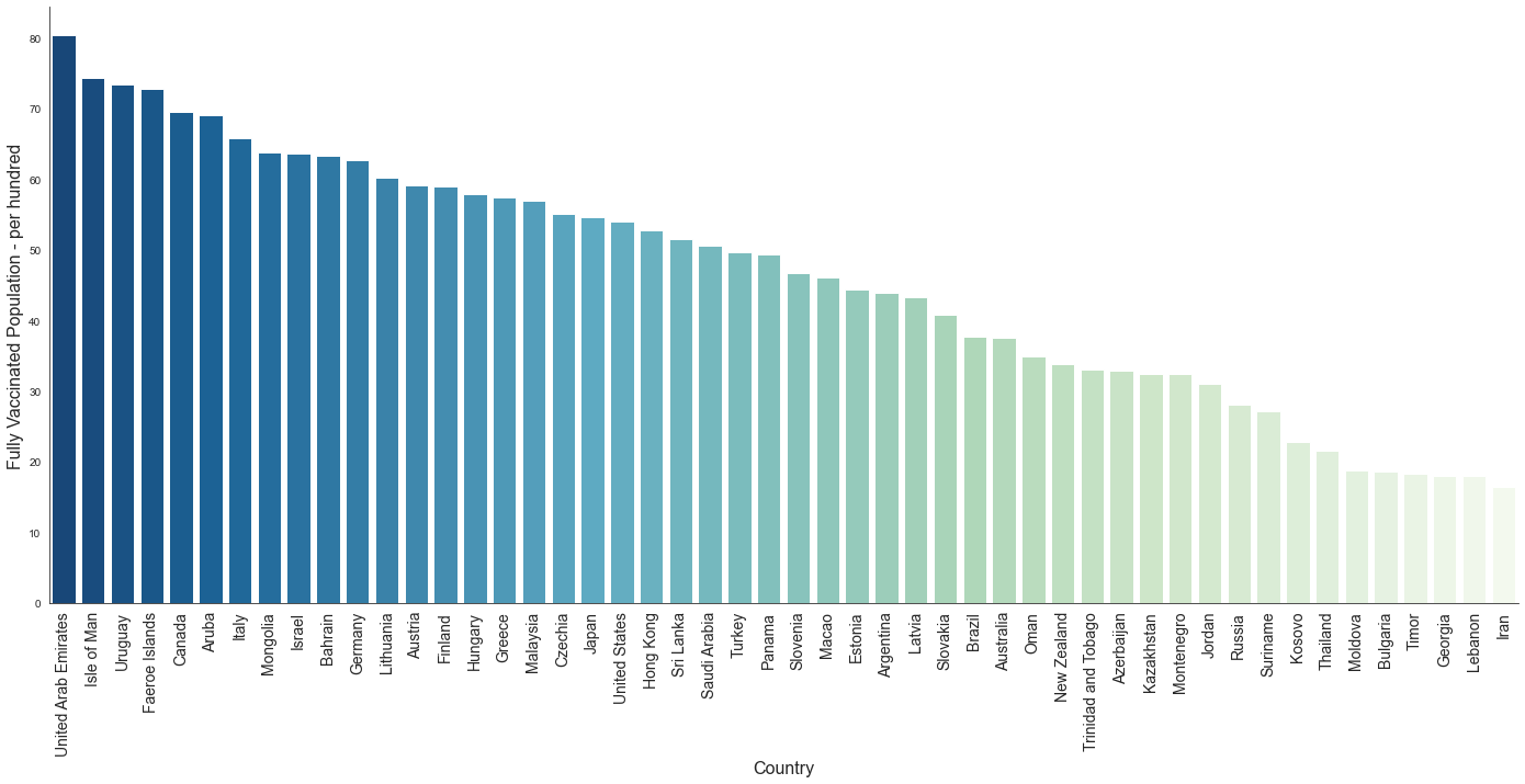
What story does this tell? While per-capita numbers are a way to normalize the data, it crucially depends on the story that one wants to tell. Does this indicate the ease of availability of vaccines? Does it indicate the effectiveness of the healthcare system? Does this indicate the willingness of people to get the vaccine? Or something else?
Let us look at the absolute numbers for the same data and look at the chart.
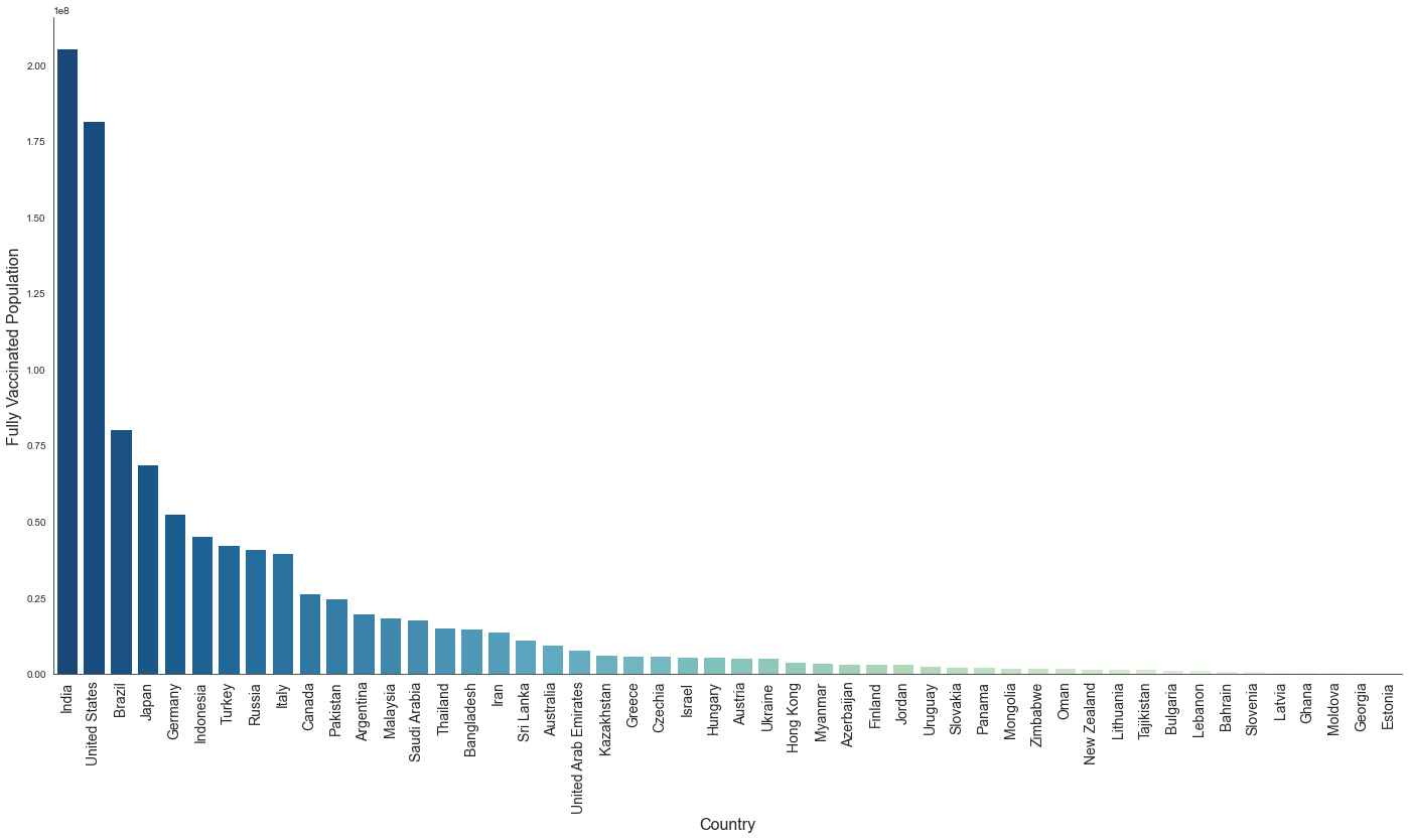
Data regarding fully vaccinated population from China was missing from the dataset and hence it does not show up in the chart. China had the most fully vaccinated population (absolute numbers) in September, 2021.
We see a different picture. What story does this tell?
While both of the above charts convey useful information, it is necessary to understand what useful story could be told using the above. For example, the first chart (per-capita) could indicate what percentage of the total population is vaccinated. This could indicate to what extent the spread of the virus or hospitalizations could be contained and that very likely these countries could get out of the pandemic sooner and become safer to travel to. It does not indicate the effectiveness of the healthcare system or the challenges in getting more people vaccinated, etc.
The second chart shows the absolute number of people vaccinated in many countries. The difference between the two charts could show the challenges in getting the population vaccinated - it could be geographical as in some countries might be too large posing a logistics challenge, it could be the size of the population - even if enough vaccines are in supply more would be needed to get the entire population vaccinated or it could be a short supply of vaccines - again because of lack of storage or the price or a weak healthcare infrastructure.
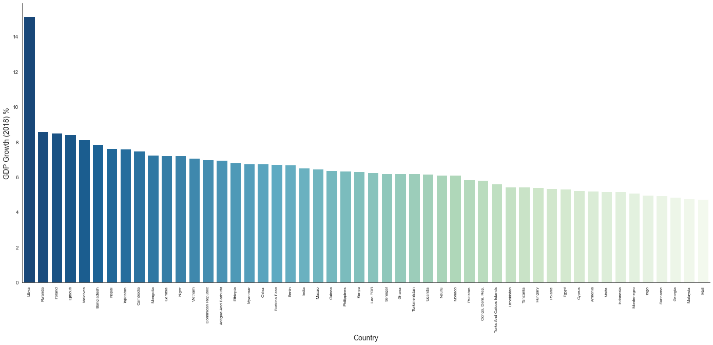
On similar lines, when you look at GDP data and plot the top 50 countries by GDP the chart looks something like the following.
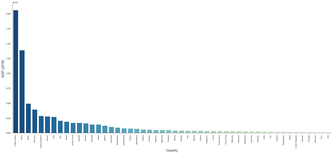
The GDP numbers are from 2018 rather than latest numbers in order to avoid the variations of the effects of the pandemic on GDP.
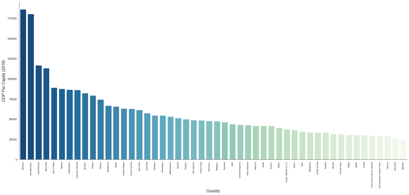
It shows the wealthiest countries (in terms of GDP). But does the wealth trickle down to every individual? Again, there might be challenges like population, management of funds, etc. Once you look at per-capita numbers one could see how different countries fare.
When you look at the GDP growth rate, it tells a different story - the countries that are improving from their past year. Yes, Libya did have 15% GDP growth in 2018.
The chart we choose should depend on the story we want to tell. It is imperative to explicitly explain the choice of chart and how it tells the story the writer wants to tell and also the stories it does not.
The vaccination data used here is from a Kaggle dataset.